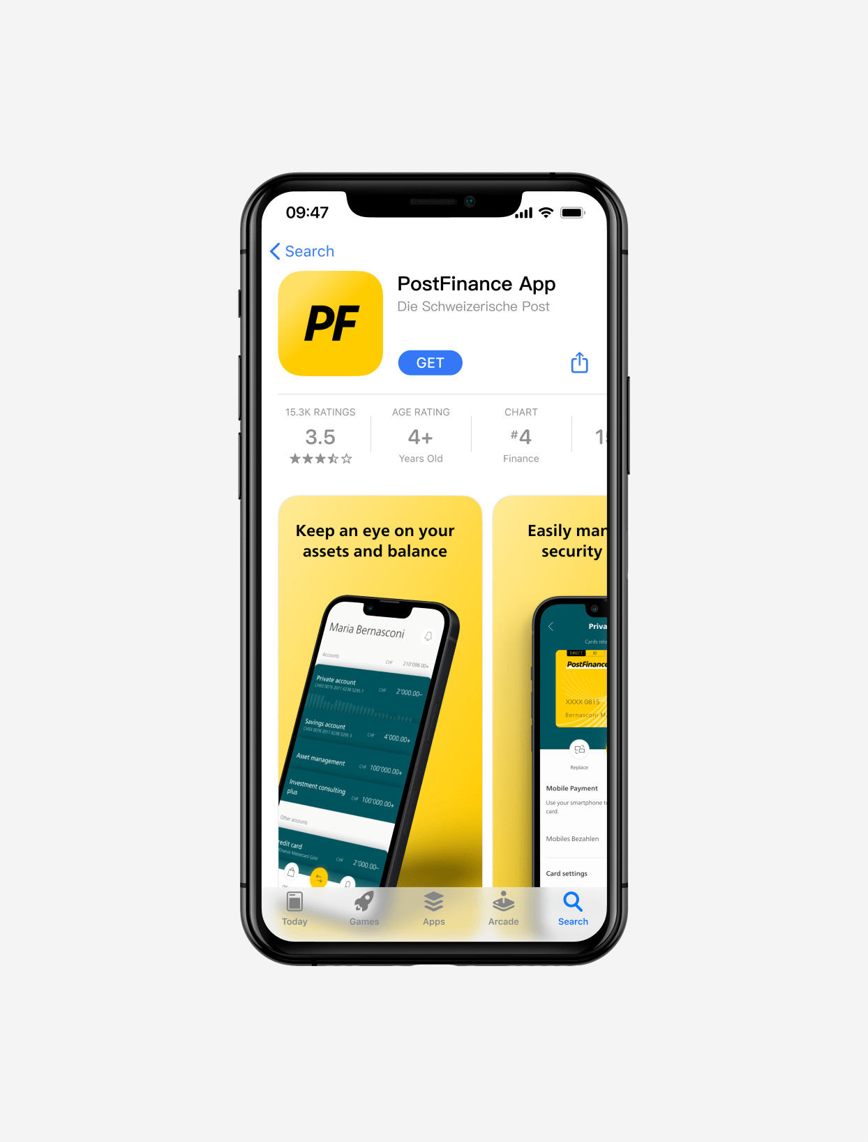
PostFinance App
Postfinance is one of the largest bank in Switzerland. I and two other designers revamped it's mobile app to be up to todays standards.
Context
Consumer expectations of online and mobile services continue to increase with new technologies. PostFinance wished to lay the foundation for addressing these demands by introducing a cutting-edge mobile app.
Challenges
With an app reaching all user groups in their daily life, it was essential to hear them at every step. We did numerous usability tests, and the company's diverse departments regularly challenged our findings.
In addition, we were dealing with the high-security aspect that constituted a considerable challenge.
Solution
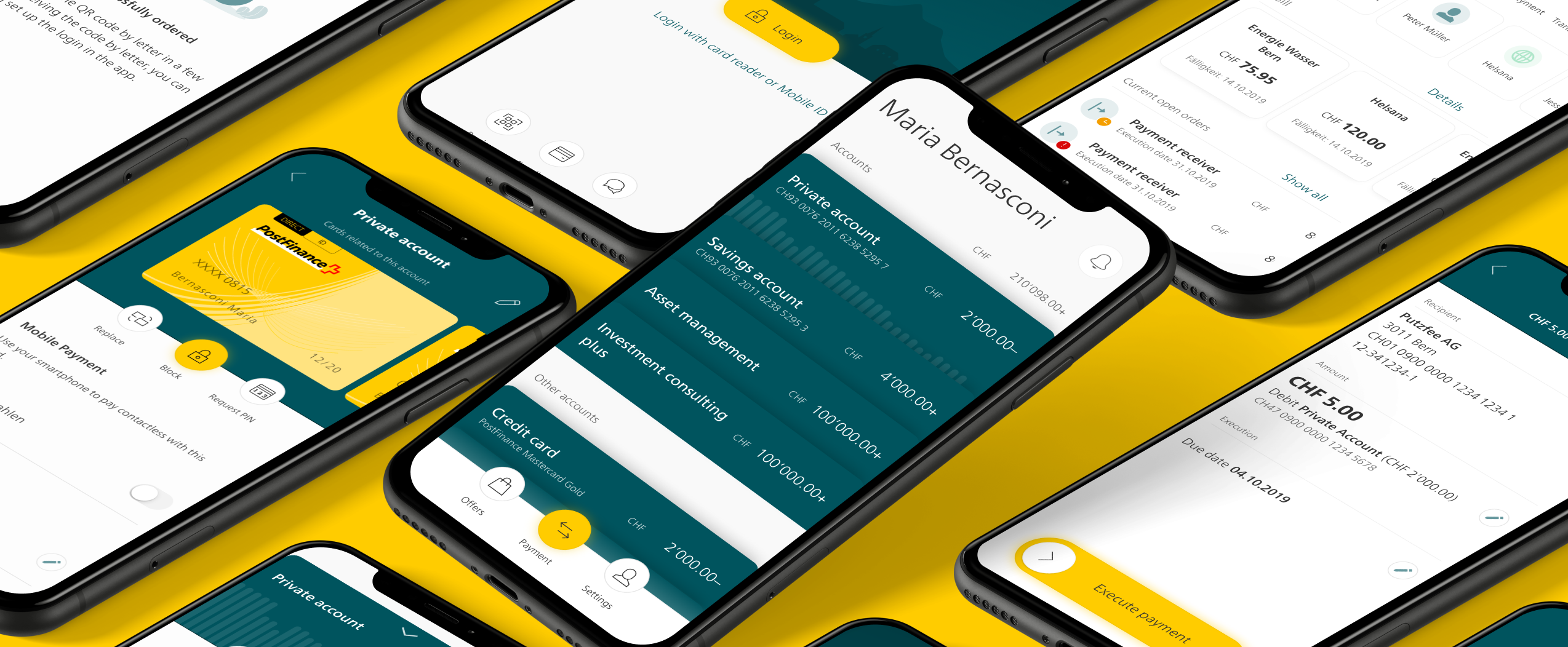
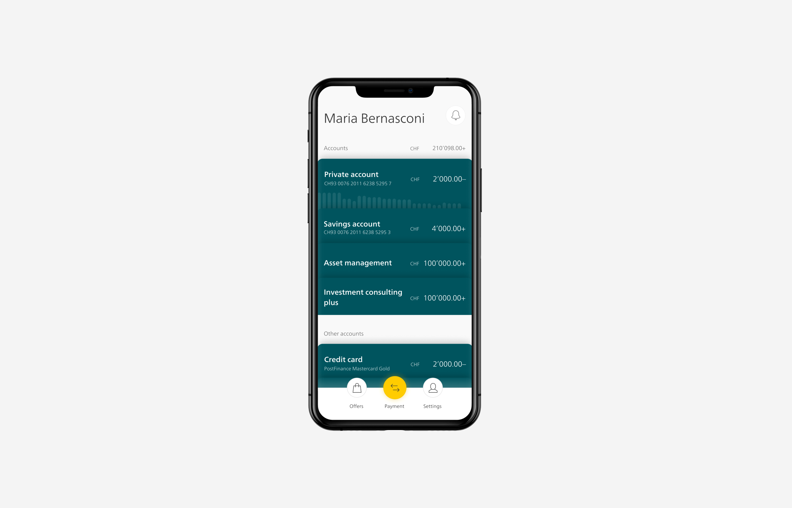
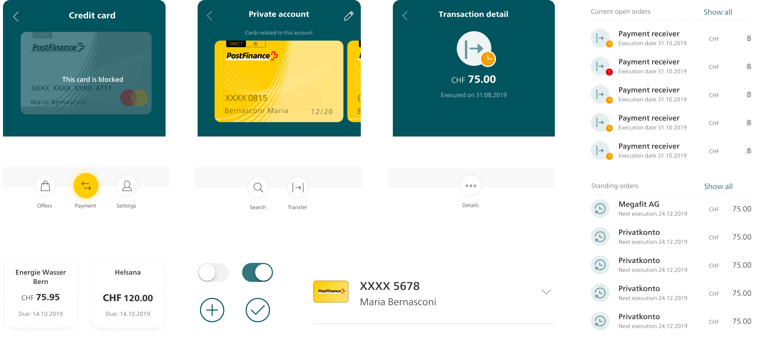
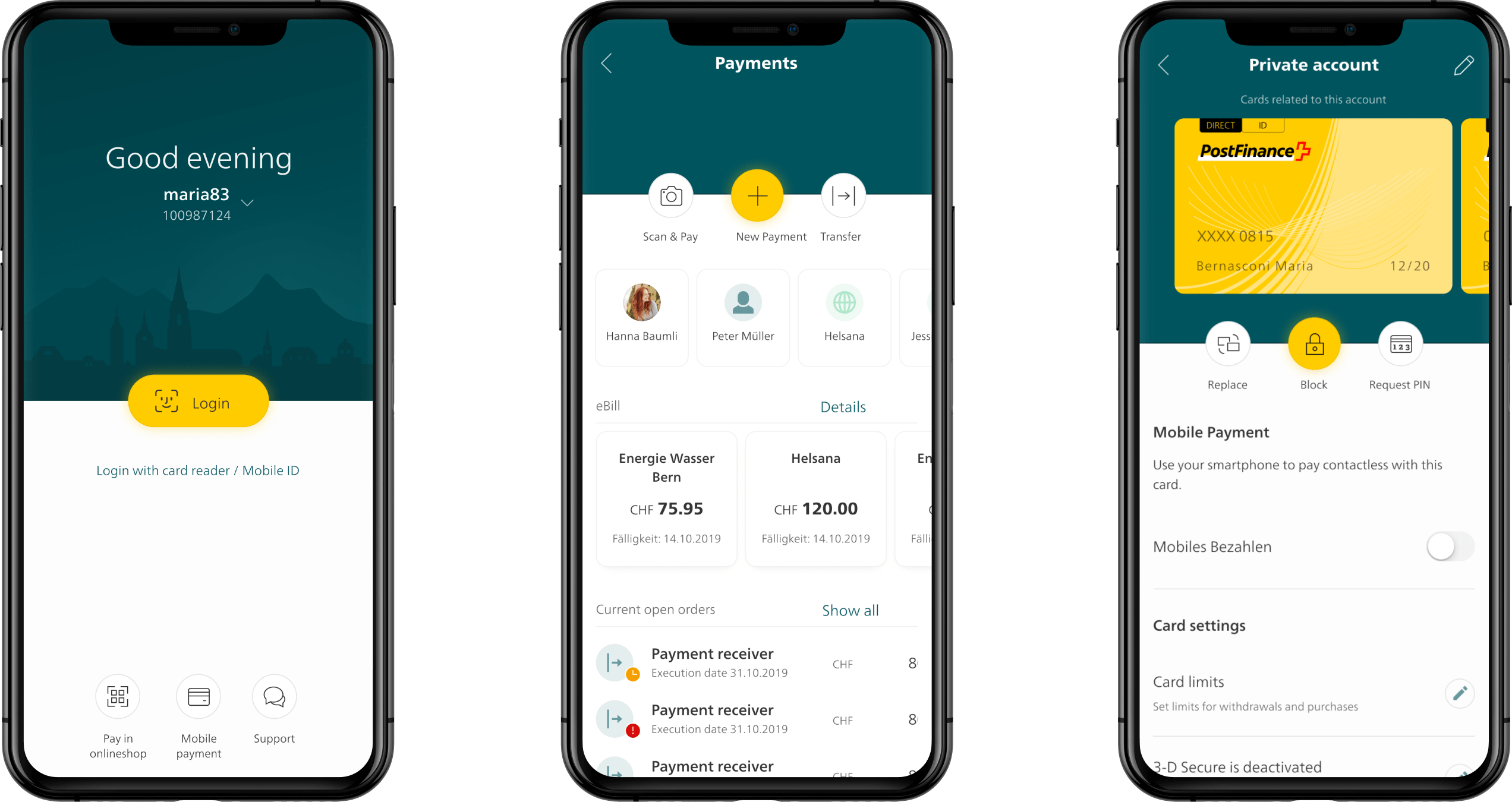
We re-imagined a clean navigation and simplified features through research, usability tests, and contextual life examples.
The new experience allowed users to scan details at a high level or dive deep and process their daily banking transactions fast and efficiently. A second focus was establishing a robust design system and a motion design system.
Client
Postfinance
Project
e-banking app
Roles
User experience
Motion and animation
Motion specification
Design Direction
Product design
Created at
Ginetta
Year
2019 - 2021
Team
Jessica Müller
Martin Von Siebhental
Marta Angelini
Frank Salathé
Mara Hellstern
Simon Raess
Design system
Efficiency, relevancy, and modularity became our guiding UX principles. The delicate balance between product and purpose was the driving force behind our entire design system. We set out to strip away any excess that did not support our larger goal of one centralized digital experience.
Motion
We introduced motion from the beginning as guidance to the users. It had to evoke security and purpose. We also created a personalized animated icon and illustration system playing with a limited amount of color mixes.
To save some precious development time, every interaction had not only been tested but also specified.
Success and status icons.
Some animated notifications, also used sometimes as empty state.
Brand refresh
The app icon illustrates the concept: an organic transition to simplicity. From the full name PostFinance to PF, the nickname it got over time.
Due to fast loading, the splash screen is purely cosmetic but it felt essential to our test users.